This vignette goes through all the functionality of the package. If you want to see examples with real data, you can refer to vignette('examples', 'ggHoriPlot').
Introduction
The data used through this vignette are tables with sine waves, which aims to mimic time-series data. The data looks like this:
x = 1:300
y = x * sin(0.1 * x)
dat_tab <- tibble(x = x,
       xend = x+0.9999,
       y = y)

x = 1:400
y = x * sin(0.2 * x) + 100
dat_tab_bis <- tibble(x = x,
       xend = x+0.9999,
       y = y)

tab_tot <- mutate(dat_tab, type = 'A') %>%
  bind_rows(mutate(dat_tab_bis, type='B'))

tab_tot %>%
  ggplot() +
  geom_line(aes(x, y)) +
  facet_wrap(~type, scales = 'free_y', ncol = 1) +
  theme_few()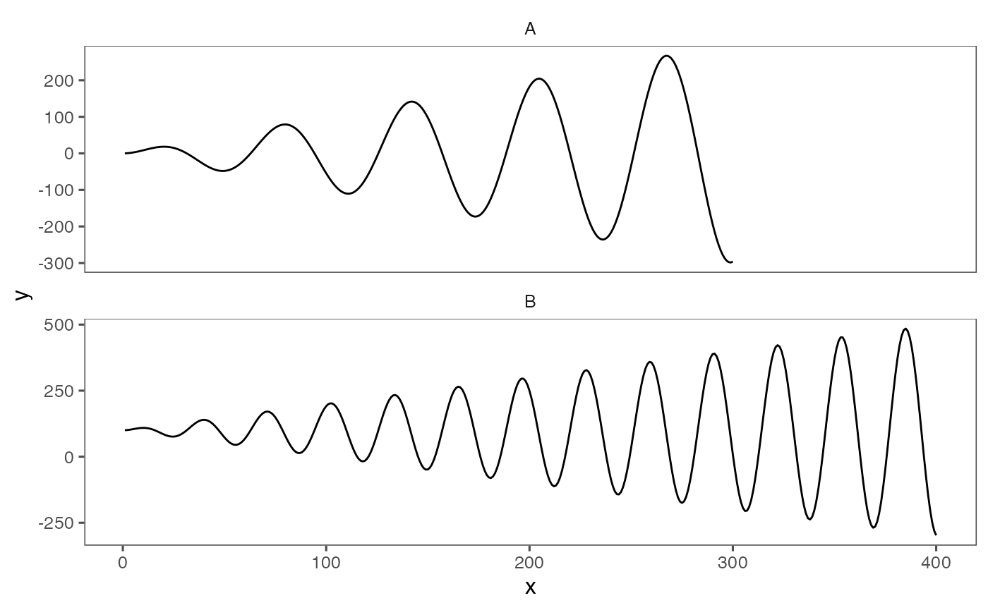
This representation of the dataset is fine if we only have a few waves. However, if we aim to represent and compare time series with many entries, it might be challenging to plot them as line charts. A more convenient way to plot this type of datasets are horizon plots, which are able to condense the data but still retain all the information. You can learn more about horizon plots here.
ggHoriPlot allows you to easily build horizon plots in ggplot2. First we will load the package and a helper functions that can be used to visualize and compare horizon plots and line charts.
library(ggHoriPlot)


plotAllLayers <- function(dat, ori, cutpoints, colors){
  # Helper function to plot the origin and cutpoints
  # of the horizon plot for comparison
  p <- ggplot()
  acc <- 1
  for (i in cutpoints[cutpoints<=ori]) {
    colo <- colors[acc]
    p <- p + geom_ribbon(aes(x = x, y = y, ymin = y, ymax = ori),
                         fill = colo,
              data = mutate(dat, y = ifelse(between(y, i, ori), y,
                                                ifelse(y<ori, i, ori))))
    acc <- acc+1
  }
  for (i in cutpoints[cutpoints>=ori]) {
    colo <- colors[acc]
    p <- p + geom_ribbon(aes(x = x, y = y, ymin = ori, ymax = y),
                         fill = colo,
              data = mutate(dat, y = ifelse(between(y, ori, i), y,
                                                ifelse(y>ori, i, ori))))
    acc <- acc+1
  }


  p+geom_line(aes(x, y), data=dat)+
    theme_few()
}
We are now all set! By using geom_horizon() we can add a layer in the ggplot2 framework to build a horizon plot.
a <- dat_tab %>%
  ggplot() +
  geom_horizon(aes(x = x, y=y))

a
The default ggplot2 fill colors might not be the best choice of palette for horizon plots. Instead, we can use the scale_fill_hcl() function to choose an appropriate color scheme. The default palette will color low values red and large values blue.
a <- dat_tab %>%
  ggplot() +
  geom_horizon(aes(x = x, y=y)) +
  theme_few()  +
  scale_fill_hcl()

a
To understand how horizon plots are related to line charts, we can plot both side by side.
a <- dat_tab %>%
  ggplot() +
  geom_horizon(
    aes(x = x,
    y=y)
  ) +
  theme_few()  +
  scale_fill_hcl()

cutpoints  <- tibble(
  cuts = c(78.48221,  172.74027,  266.99833, -110.03390, -204.29196, -298.55001),
  names = c('ypos1', 'ypos2', 'ypos3', 'yneg1', 'yneg2', 'yneg3'),
  color = c("#D7E2D4", "#36ABA9", "#324DA0", "#F6DE90", "#E78200", "#A51122")
) %>%
  mutate(names = factor(names, rev(names))) %>%
  arrange(names)


mid <- sum(range(dat_tab$y, na.rm = T))/2

b <- plotAllLayers(dat_tab, mid, cutpoints$cuts, cutpoints$color)

b/a+ plot_layout(guides = 'collect', heights = c(6, 1))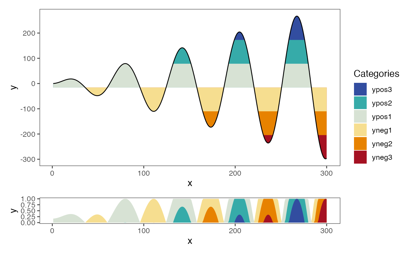
The resulting figure shows how the sine curve of this example can be condensed into a stripe instead of a full line chart.
ggHoriPlot can also output the exact intervals for each cutpoint by simply adding fill=..Cutpoints.. in the aesthetics:
a <- dat_tab %>%
  ggplot() +
  geom_horizon(
    aes(x = x,
    y=y,
    fill=..Cutpoints..)
  ) +
  theme_few()  +
  scale_fill_hcl()

cutpoints  <- tibble(
  cuts = c(78.48221,  172.74027,  266.99833, -110.03390, -204.29196, -298.55001),
  names = c('ypos1', 'ypos2', 'ypos3', 'yneg1', 'yneg2', 'yneg3'),
  color = c("#D7E2D4", "#36ABA9", "#324DA0", "#F6DE90", "#E78200", "#A51122")
) %>%
  mutate(names = factor(names, rev(names))) %>%
  arrange(names)


mid <- sum(range(dat_tab$y, na.rm = T))/2

b <- plotAllLayers(dat_tab, mid, cutpoints$cuts, cutpoints$color)

b/a+ plot_layout(guides = 'collect', heights = c(6, 1))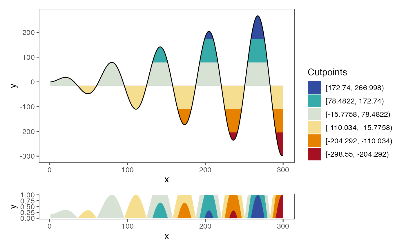
Changing the origin
Median
The above example with default settings calculates the origin of the horizon plot as the midpoint between the data range. Sometimes, however, we might want to use some other origin for our data. In ggHoriPlot this can be achieved by specifying the desired origin argument in geom_horizon(). For example, if we want to use the median as the origin:
a <- dat_tab %>%
  ggplot() +
  geom_horizon(
    aes(x = x,
    y=y,
    fill=..Cutpoints..),
    origin = 'median'
  ) +
  theme_few() +
  scale_fill_hcl()

cutpoints  <- tibble(
  cuts = c(96.20134, 190.4594, 284.7174, -92.31478, -186.57283, -280.83089),
  names = c('ypos1', 'ypos2', 'ypos3', 'yneg1', 'yneg2', 'yneg3'),
  color = c("#D7E2D4", "#36ABA9", "#324DA0", "#F6DE90", "#E78200", "#A51122")
) %>%
  mutate(names = factor(names, rev(names))) %>%
  arrange(names)

me <- median(dat_tab$y, na.rm = T)

b <- plotAllLayers(dat_tab, me, cutpoints$cuts, cutpoints$color)

b/a+ plot_layout(guides = 'collect', heights = c(6, 1))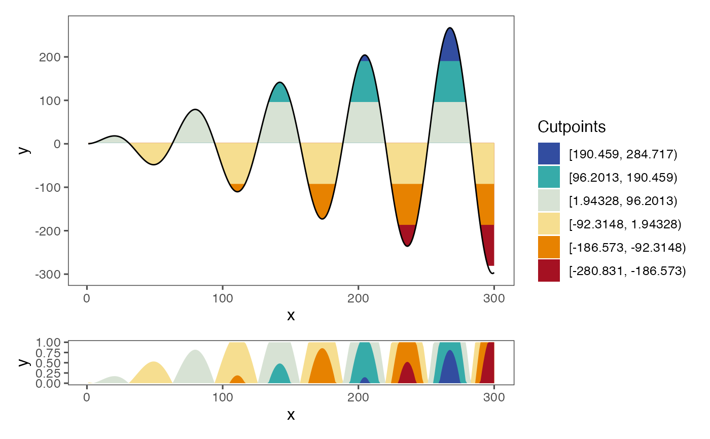
Note that the horizon scale –this is, the regular interval that determines the cutpoints–, is still the same as when using the midpoint. This might produce some cutpoints that do not entirely match the range of values. In the above example, limit for the upper interval (the bluest interval) falls outside of the range of values. At the other end, the limit for the lower interval (the reddest interval) falls within the range of the data. All the data values that are above the upper limit or (as happens in this case) below the lower limit are colored as the closest interval.
Mean
The origin can also be specified to be the mean:
a <- dat_tab %>%
  ggplot() +
  geom_horizon(
    aes(x = x,
    y=y,
    fill=..Cutpoints..),
    origin = 'mean'
  ) +
  theme_few() +
  scale_fill_hcl()

cutpoints  <- tibble(
  cuts = c(91.89319,  186.15125,  280.40931,  -96.62292, -190.88098, -285.13903),
  names = c('ypos1', 'ypos2', 'ypos3', 'yneg1', 'yneg2', 'yneg3'),
  color = c("#D7E2D4", "#36ABA9", "#324DA0", "#F6DE90", "#E78200", "#A51122")
) %>%
  mutate(
    names = factor(names, rev(names)),
    y_max = ifelse(cuts == min(cuts),
              -Inf,
              ifelse(
                cuts == max(cuts),
                Inf,
                cuts))) %>%
  arrange(names)


me <- mean(dat_tab$y, na.rm = T)

b <- plotAllLayers(dat_tab, me, cutpoints$cuts, cutpoints$color)


b/a+ plot_layout(guides = 'collect', heights = c(6, 1))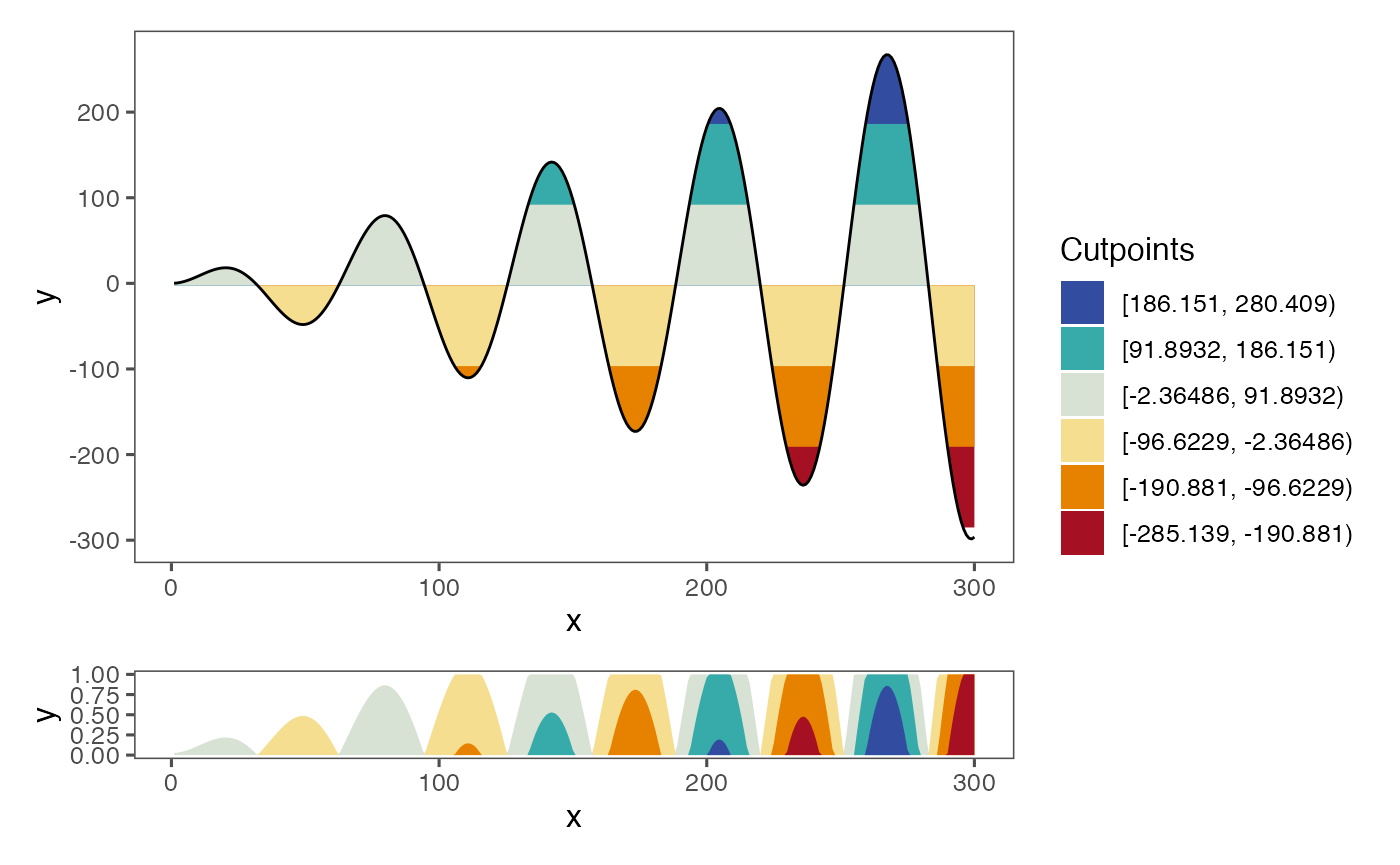
User-specified
Alternatively, the origin might also be a manually chosen number:
a <- dat_tab %>%
  ggplot() +
  geom_horizon(
    aes(x = x,
    y=y,
    fill=..Cutpoints..),
    origin = 50
  ) +
  theme_few() +
  scale_fill_hcl()

cutpoints  <- tibble(
  cuts = c(144.25806,  238.51611,  332.77417,  -44.25806, -138.51611, -232.77417),
  names = c('ypos1', 'ypos2', 'ypos3', 'yneg1', 'yneg2', 'yneg3'),
  color = c("#D7E2D4", "#36ABA9", "#324DA0", "#F6DE90", "#E78200", "#A51122")
) %>%
  mutate(names = factor(names, rev(names))) %>%
  arrange(names)


b <- plotAllLayers(dat_tab, 50, cutpoints$cuts, cutpoints$color)

b/a+ plot_layout(guides = 'collect', heights = c(6, 1))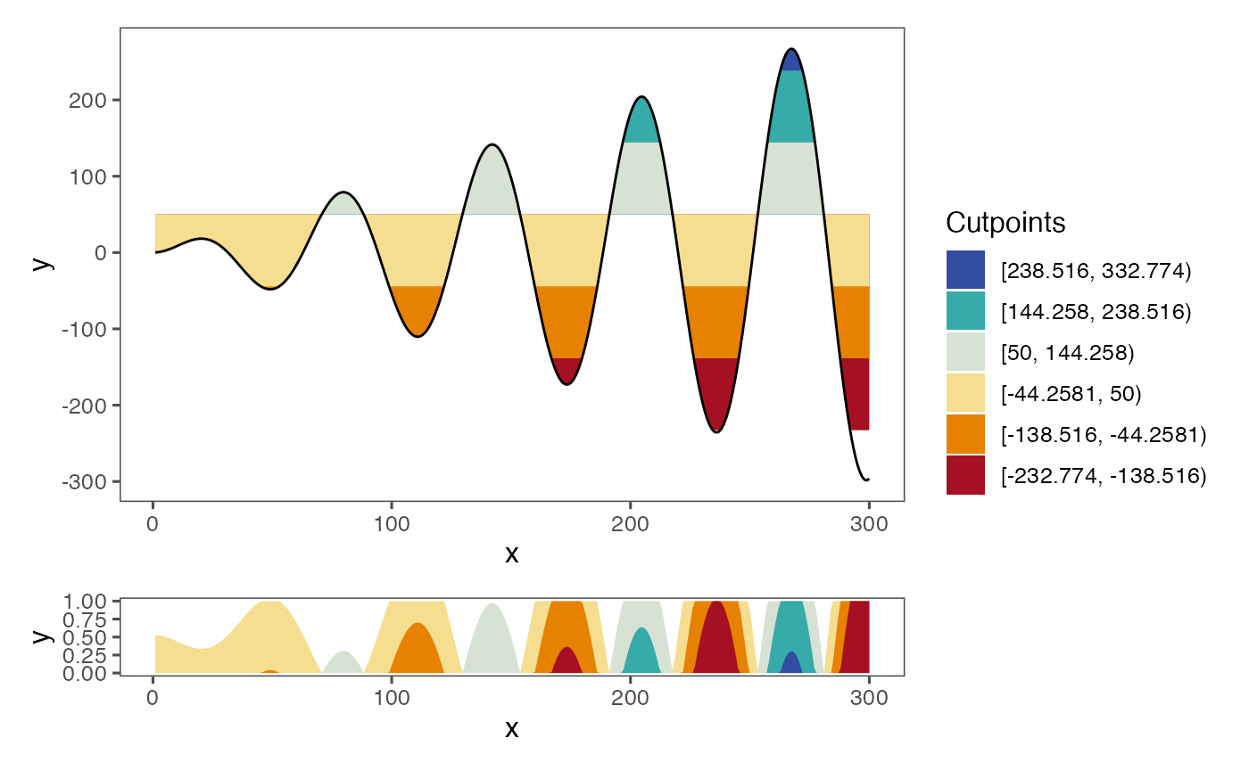
Quantiles
If we specify the origin to be quantiles, then the origin will be set to the median and the cutpoints will be set to equally sized quantiles:
a <- dat_tab %>%
  ggplot() +
  geom_horizon(
    aes(x = x,
    y=y,
    fill=..Cutpoints..),
    origin = 'quantiles'
  ) +
  theme_few() +
  scale_fill_hcl()

cutpoints  <- tibble(
  cuts = c(43.02642,  124.15063,  266.99833,  -45.43396, -119.31147, -298.55001 ),
  names = c('ypos1', 'ypos2', 'ypos3', 'yneg1', 'yneg2', 'yneg3'),
  color = c("#D7E2D4", "#36ABA9", "#324DA0", "#F6DE90", "#E78200", "#A51122")
) %>%
  mutate(names = factor(names, rev(names))) %>%
  arrange(names)

me <- median(dat_tab$y, na.rm = T)

b <- plotAllLayers(dat_tab, me, cutpoints$cuts, cutpoints$color)

b/a+ plot_layout(guides = 'collect', heights = c(6, 1))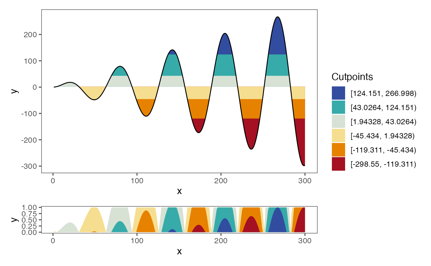
Note that this might produce intervals that do not have the same size, which can be undesirable and/or deceiving.
Origin as lowest value
Sometimes we are not interested in plotting values as both above and below the origin. In those cases, we can specify the origin to be the smallest value by setting origin='min', so all values are above the origin.
a <- dat_tab %>%
  ggplot() +
  geom_horizon(
    aes(x = x,
    # xend = xend,
    y=y,
    fill=..Cutpoints..),
    horizonscale = 6,
    origin = 'min'
  ) +
  theme_few() +
  scale_fill_hcl()


cutpoints_a  <- tibble(
  cuts = c(-15.78, 78.48,  172.74,  266.998, -110.034, -204.292, -298.55),
  color = c("#D7E2D4", "#36ABA9", "#324DA0", 'white', "#F6DE90", "#E78200", "#A51122")
)

cutpoints_a  <- cutpoints_a %>% arrange(desc(cuts))


b <- plotAllLayers(dat_tab, -298.55, cutpoints_a$cuts, cutpoints_a$color)

(b/a) + plot_layout(guides = 'collect', heights = c(6, 1))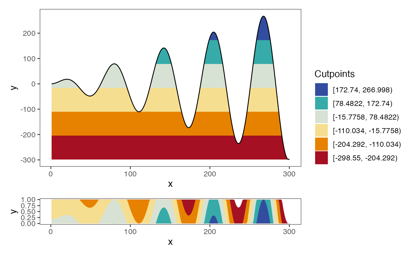
For this example the red and blue coloring does not make much sense. Instead, you can choose another hcl palette and specify it in scale_fill_hcl(). For example, a single-hue palette is much more appropriate:
a <- dat_tab %>%
  ggplot() +
  geom_horizon(
    aes(x = x,
    # xend = xend,
    y=y,
    fill=..Cutpoints..),
    horizonscale = 6,
    origin = 'min'
  ) +
  theme_few() +
  scale_fill_hcl(palette = 'Purple-Orange', reverse = T)


cutpoints_a  <- tibble(
  cuts = c(-15.78, 78.48,  172.74,  266.998, -110.034, -204.292, -298.55),
  color = c( "#B76AA8", "#8F4D9F","#5B3794", 'white', "#D78CB1", "#F1B1BE", "#F8DCD9")
)

cutpoints_a  <- cutpoints_a %>% arrange(desc(cuts))


b <- plotAllLayers(dat_tab, -298.55, cutpoints_a$cuts, cutpoints_a$color)

(b/a) + plot_layout(guides = 'collect', heights = c(6, 1))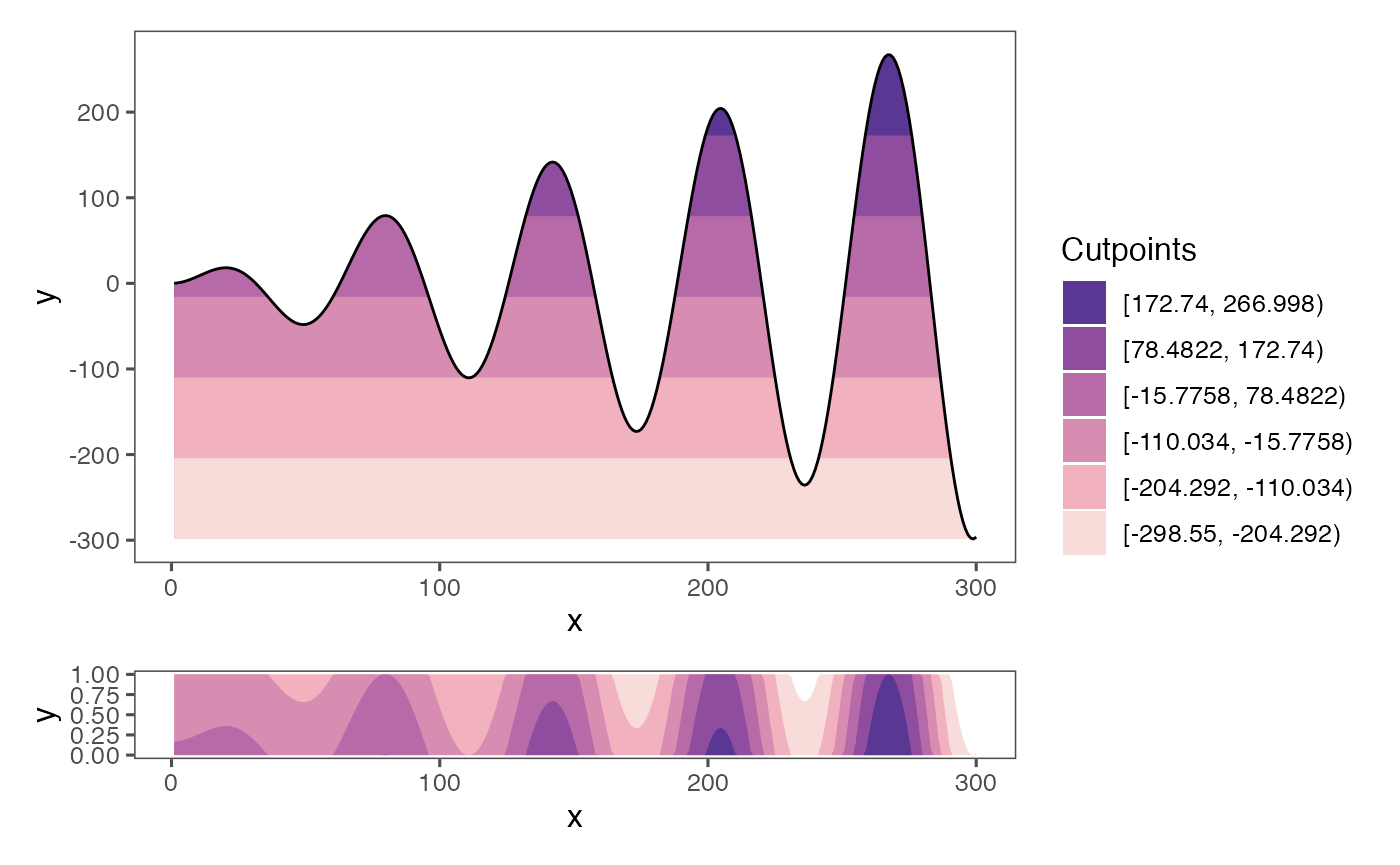
You can list all available palettes by running hcl.pals().
Changing the horizon scale
Apart from the origin, ggHoriPlot also allows to customize the horizon scale, this is, the number of cuts and where they happen. The default number of cuts is set to 6, as in all of the examples above, but it can be set to any other integer, such as 5 intervals:
a <- dat_tab %>%
  ggplot() +
  geom_horizon(
    aes(x = x,
    # xend = xend,
    y=y,
    fill=..Cutpoints..),
    horizonscale = 5,
    origin = 'midpoint'
  ) +
  theme_few() +
  scale_fill_hcl()

cutpoints  <- tibble(
  cuts = c(97.33383,  210.44349, -128.88551, -241.99518, -355.10485),
  names = c('ypos1', 'ypos2',  'yneg1', 'yneg2', 'yneg3'),
  color = c("#69BBAB", "#324DA0", "#FEFDBE", "#EB9C00", "#A51122")
) %>%
  mutate(names = factor(names, rev(names))) %>%
  arrange(names)


mid <- sum(range(dat_tab$y, na.rm = T))/2

b <- plotAllLayers(dat_tab, mid, cutpoints$cuts, cutpoints$color)

b/a+ plot_layout(guides = 'collect', heights = c(5, 1))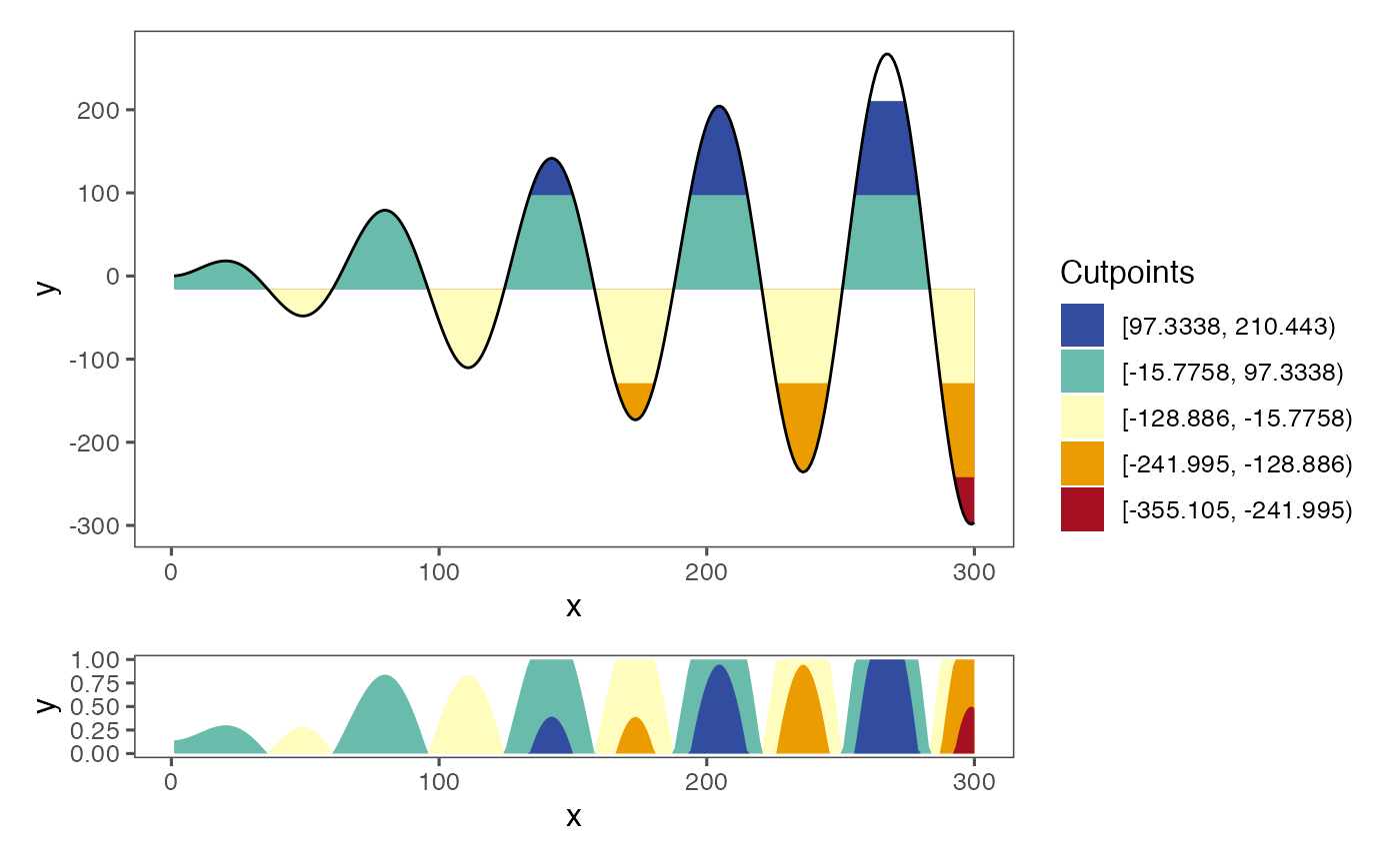
or 10 intervals instead:
a <- dat_tab %>%
  ggplot() +
  geom_horizon(
    aes(x = x,
    # xend = xend,
    y=y,
    fill=..Cutpoints..),
    horizonscale = 10,
    origin = 'midpoint'
  ) +
  theme_few() +
  scale_fill_hcl()

cutpoints  <- tibble(
  cuts = c(40.77899 ,  97.33383 , 153.88866,  210.44349 , 266.99833 ,
           -72.33068, -128.88551, -185.44035, -241.99518, -298.55001),
  names = c('ypos1', 'ypos2', 'ypos3', 'ypos4', 'ypos5', 'yneg1', 'yneg2', 'yneg3', 'yneg4', 'yneg5'),
  color = c("#E5F0D6", "#ACD2BB" ,"#4EB2A9" ,"#0088A7", "#324DA0",
                "#FAEDA9","#F1C363","#E98E00", "#DC4A00", "#A51122")
) %>%
  mutate(names = factor(names, rev(names))) %>%
  arrange(names)

mid <- sum(range(dat_tab$y, na.rm = T))/2

b <- plotAllLayers(dat_tab, mid, cutpoints$cuts, cutpoints$color)


b/a + plot_layout(guides = 'collect', heights = c(10, 1))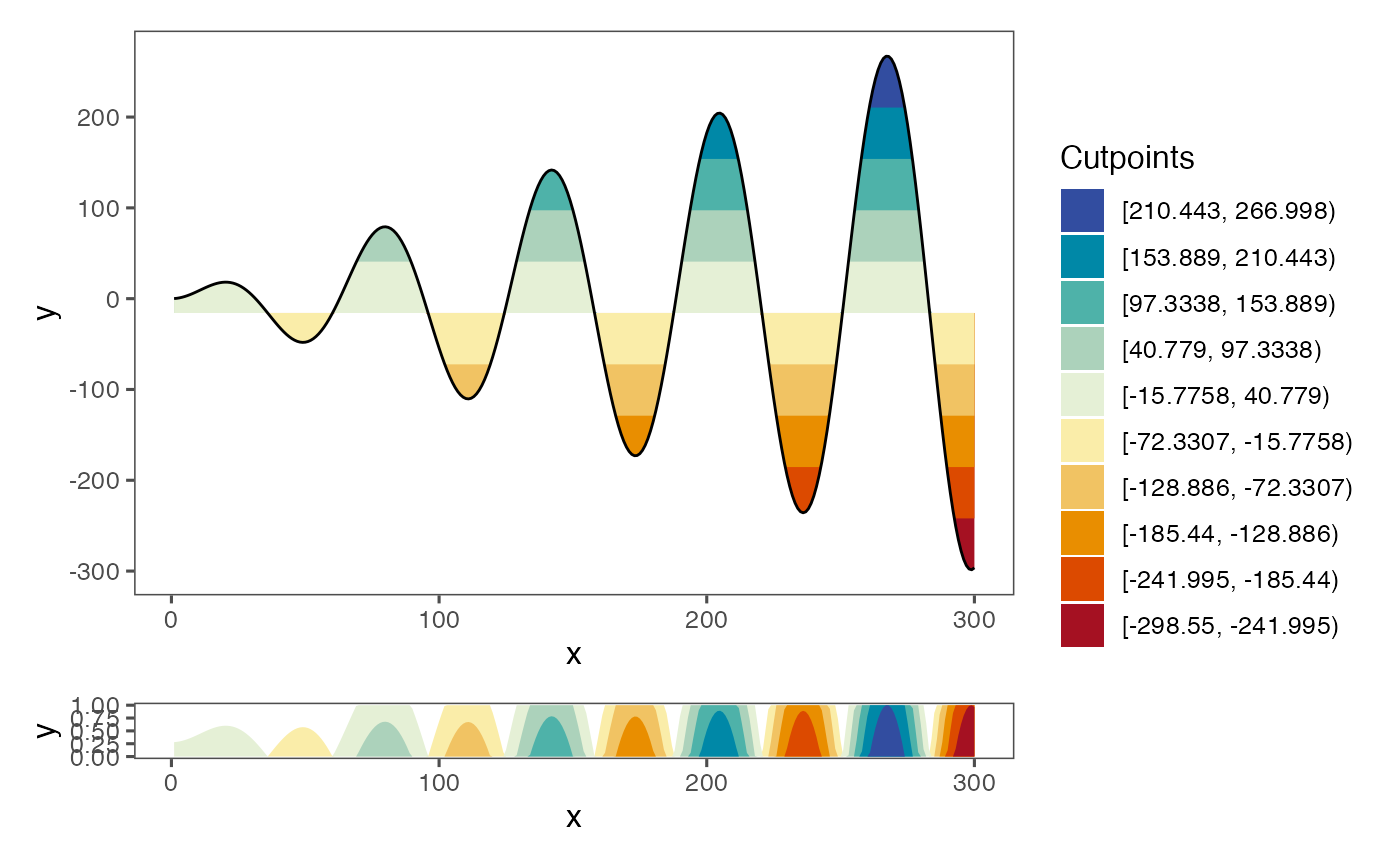
Finally, we can also specify our own intervals by providing a vector of cutpoints:
a <- dat_tab %>%
  ggplot() +
  geom_horizon(
    aes(x = x,
    y=y,
    fill=..Cutpoints..),
    horizonscale = c(78.48221,  172.74027,
                     266.99833, -110.03390,
                     -204.29196, -298.55001),
    origin = -15.77584
  ) +
  theme_few()  +
  scale_fill_hcl()

cutpoints  <- tibble(
  cuts = c(78.48221,  172.74027,  266.99833, -110.03390, -204.29196, -298.55001),
  names = c('ypos1', 'ypos2', 'ypos3', 'yneg1', 'yneg2', 'yneg3'),
  color = c("#D7E2D4", "#36ABA9", "#324DA0", "#F6DE90", "#E78200", "#A51122")
) %>%
  mutate(names = factor(names, rev(names))) %>%
  arrange(names)


mid <- sum(range(dat_tab$y, na.rm = T))/2

b <- plotAllLayers(dat_tab, mid, cutpoints$cuts, cutpoints$color)

b/a+ plot_layout(guides = 'collect', heights = c(6, 1))
Additional features
Interval data
Some data might have starting and end points for x values. If that is the case, the line chart will have a step-like shape. ggHoriPlot can also plot this kind of data. We simply need to specify the end coordinates using the xend aesthetics inside geom_horizon():
a <- dat_tab %>%
  ggplot() +
  geom_horizon(
    aes(x = x,
    xend = xend,
    y=y,
    fill=..Cutpoints..),
    horizonscale = 6,
    origin = 'midpoint'
  ) +
  theme_few() +
  scale_fill_hcl()

cutpoints  <- tibble(
  cuts = c(78.48221,  172.74027,  266.99833, -110.03390, -204.29196, -298.55001),
  names = c('ypos1', 'ypos2', 'ypos3', 'yneg1', 'yneg2', 'yneg3'),
  color = c("#D7E2D4", "#36ABA9", "#324DA0", "#F6DE90", "#E78200", "#A51122")
) %>%
  mutate(names = factor(names, rev(names))) %>%
  arrange(names)

dt <- dat_tab %>%
  pivot_longer(c(x, xend)) %>%
  mutate(x = value)

b <- plotAllLayers(dt, mid, cutpoints$cuts, cutpoints$color)

b/a+ plot_layout(guides = 'collect', heights = c(6, 1))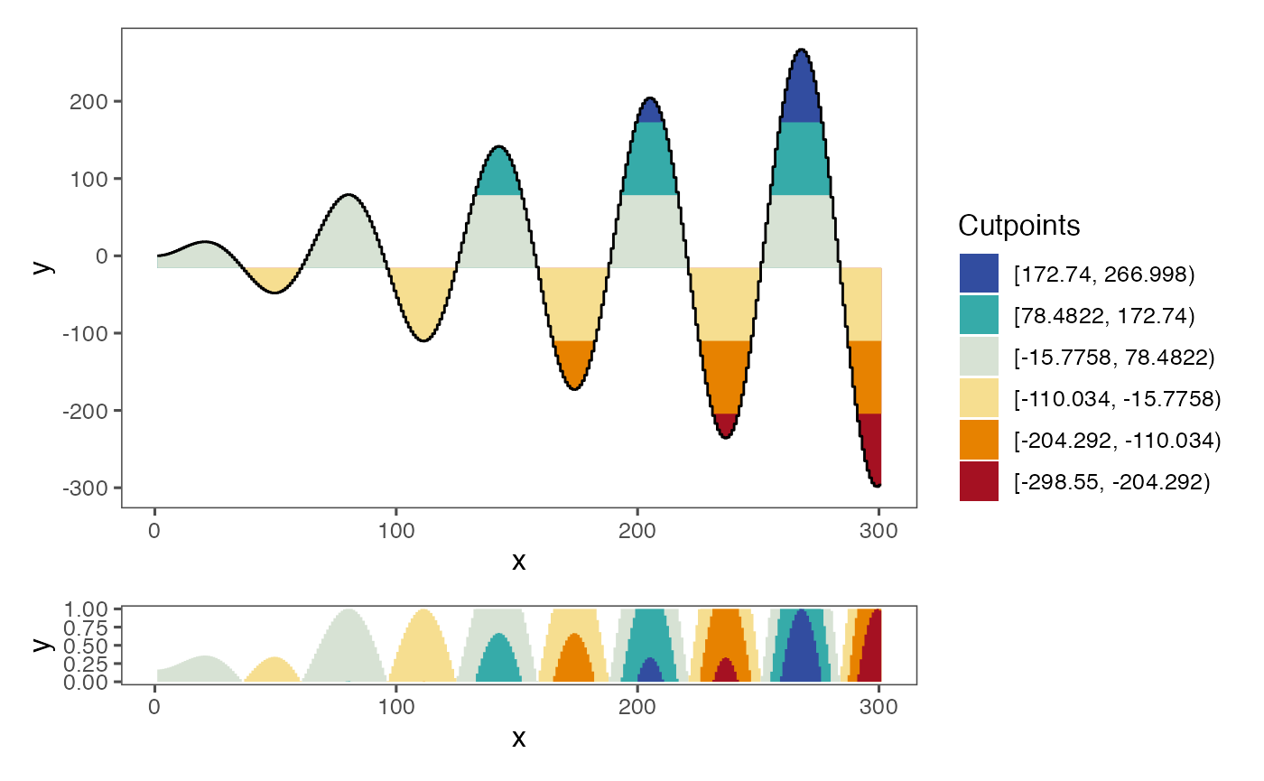
As a side note, xend values need to be different from the following x value, otherwise ggHoriPlot might not work properly. If this is not the case, try subtracting a small value to xend.
Faceting
ggHoriPlot can also be used to facet the data, which is specially useful if different time series need to be compared:
tab_tot %>%
  ggplot() +
  geom_horizon(aes(x = x, y=y)) +
  facet_wrap(~type, ncol = 1, scales = 'free_y') +
  theme_few() +
  scale_fill_hcl()
Note that the cutpoints are calculated per facet separately, so the color of each plot is relative to itself. This can be seen when specifying fill = ..Cutpoints..:
tab_tot %>%
  ggplot() +
  geom_horizon(aes(x = x, y=y, fill = ..Cutpoints..)) +
  facet_wrap(~type, ncol = 1, scales = 'free_y') +
  theme_few() +
  scale_fill_hcl()
Here we can sew how there are six different cutpoints per facet. If we wanted to have the same cutpoints for all the facets, we would need to calculate them and supply them in the horizonscale argument of geom_horizon():
ori <- sum(range(tab_tot$y))/2
sca <- seq(range(tab_tot$y)[1], range(tab_tot$y)[2], length.out = 7)[-4]

tab_tot %>%
  ggplot() +
  geom_horizon(aes(x = x, y=y, fill = ..Cutpoints..),
               origin = ori, horizonscale = sca) +
  facet_wrap(~type, ncol = 1, scales = 'free_y') +
  theme_few() +
  scale_fill_hcl()
Handling outliers
Outliers or very prominent peaks and valleys might greatly distort a horizon plot making it hard to interpret. For example:
x = 1:300
y = sin(0.1 * x) + 50*dnorm(x, 150, 2)
dat_tab_outlier <- tibble(x = x,
       xend = x+0.9999,
       y = y)

a1 <- dat_tab_outlier %>%
  ggplot() +
  geom_horizon(
    aes(x = x,
    y=y,
    fill=..Cutpoints..)
  ) +
  theme_few() +
  scale_fill_hcl()

cutpoints_a1  <- tibble(
  cuts = c(6.7492332,  8.6865390, 10.6238449,  2.8746215,  0.9373156, -0.9999902),
  names = c('ypos1', 'ypos2', 'ypos3', 'yneg1', 'yneg2', 'yneg3'),
  color = c("#D7E2D4", "#36ABA9", "#324DA0", "#F6DE90", "#E78200", "#A51122")
) %>%
  mutate(names = factor(names, rev(names))) %>%
  arrange(names)

b1 <- plotAllLayers(dat_tab_outlier, 4.811927, cutpoints_a1$cuts, cutpoints_a1$color)

(b1/a1) + plot_annotation("origin = 'midpoint', rm.outliers = F")+ plot_layout(guides = 'collect', heights = c(6, 1))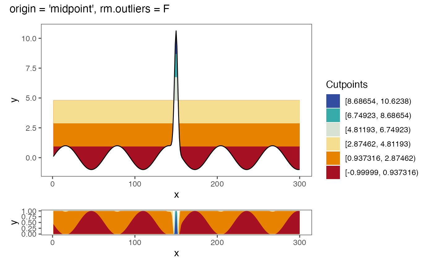
We might want to use the median instead of the default midpoint to balance the effect of the outlier:
a3 <- dat_tab_outlier %>%
  ggplot() +
  geom_horizon(
    aes(x = x,
    # xend = xend,
    y=y,
    fill=..Cutpoints..),
    horizonscale = 6,
    origin = 'median',
    rm.outliers = F
  ) +
  theme_few() +
  scale_fill_hcl()

cutpoints_a3  <- tibble(
  cuts = c(2.008043,  3.945348,  5.882654, -1.866569, -3.803875, -5.741181),
  names = c('ypos1', 'ypos2', 'ypos3', 'yneg1', 'yneg2', 'yneg3'),
  color = c("#D7E2D4", "#36ABA9", "#324DA0", "#F6DE90", "#E78200", "#A51122")
) %>%
  mutate(names = factor(names, rev(names))) %>%
  arrange(names)

b3 <- plotAllLayers(dat_tab_outlier, 0.07073676, cutpoints_a3$cuts, cutpoints_a3$color)

(b3/a3) + plot_annotation("origin = 'median', rm.outliers = F")+ plot_layout(guides = 'collect', heights = c(6, 1))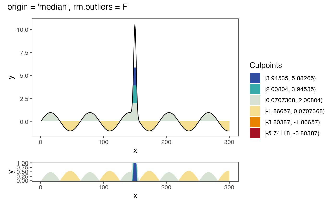
However, the horizon scale still renders the horizon plot difficult to interpret. Instead, we can tell ggHoriPlot to remove the outliers by setting the rm.outliers argument of geom_horizon() to FALSE:
a2 <- dat_tab_outlier %>%
  ggplot() +
  geom_horizon(
    aes(x = x,
    y=y,
    fill=..Cutpoints..),
    horizonscale = 6,
    origin = 'median',
    rm.outliers = T
  ) +
  theme_few() +
  scale_fill_hcl()


cutpoints_a2  <- tibble(
  cuts = c(0.5743823,  1.1151416,  1.6559008, -0.5071362, -1.0478955, -1.5886547),
  names = c('ypos1', 'ypos2', 'ypos3', 'yneg1', 'yneg2', 'yneg3'),
  color = c("#D7E2D4", "#36ABA9", "#324DA0", "#F6DE90", "#E78200", "#A51122")
) %>%
  mutate(names = factor(names, rev(names))) %>%
  arrange(names)


b2 <- plotAllLayers(dat_tab_outlier, 0.03362305, cutpoints_a2$cuts, cutpoints_a2$color)


(b2/a2) + plot_annotation("origin = 'median', rm.outliers = T")+ plot_layout(guides = 'collect', heights = c(6, 1))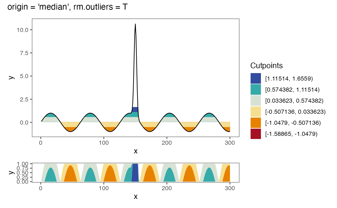
This will remove values below the 0.25 quantile - 1.5 times the interquartile range and above the 0.75 quantile + 1.5 times the interquartile range.
Another option would be to use a custom horizon scale, such as the one below:
a4 <- dat_tab_outlier %>%
  ggplot() +
  geom_horizon(
    aes(x = x,
    # xend = xend,
    y=y,
    fill=..Cutpoints..),
    horizonscale = c(seq(-1, 1, 1/3))[-4],
    origin = 0
  ) +
  theme_few() +
  scale_fill_hcl()


cutpoints_a4  <- tibble(
  cuts = c(1/3,  2/3,  1, -1/3, -2/3, -1),
  names = c('ypos1', 'ypos2', 'ypos3', 'yneg1', 'yneg2', 'yneg3'),
  color = c("#D7E2D4", "#36ABA9", "#324DA0", "#F6DE90", "#E78200", "#A51122")
) %>%
  mutate(names = factor(names, rev(names))) %>%
  arrange(names)

b4 <- plotAllLayers(dat_tab_outlier, 0, cutpoints_a4$cuts, cutpoints_a4$color)


(b4/a4) + plot_annotation("origin = 0, rm.outliers = F, custom horizonscale")+ plot_layout(guides = 'collect', heights = c(6, 1))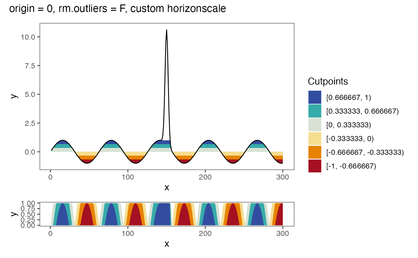
Handling of missing data
Missing data is removed from the plot:
x = 1:300
y = x * sin(0.1 * x)
dat_tab_na <- tibble(x = x,
       xend = x+0.9999,
       y = y) %>%
  mutate(
    y = ifelse(between(x, 125, 175), NA, y)
  )


a <- dat_tab_na %>%
  ggplot() +
  geom_horizon(
    aes(x = x,
    y=y,
    fill=..Cutpoints..),
  ) +
  theme_few() +
  scale_fill_hcl()

cutpoints  <- tibble(
  cuts = c(78.48221,  172.74027,  266.99833, -110.03390, -204.29196, -298.55001),
  names = c('ypos1', 'ypos2', 'ypos3', 'yneg1', 'yneg2', 'yneg3'),
  color = c("#D7E2D4", "#36ABA9", "#324DA0", "#F6DE90", "#E78200", "#A51122")
) %>%
  mutate(names = factor(names, rev(names))) %>%
  arrange(names)


mid <- sum(range(dat_tab_na$y, na.rm = T))/2

b <- plotAllLayers(dat_tab_na, mid, cutpoints$cuts, cutpoints$color)


b/a+ plot_layout(guides = 'collect', heights = c(6, 1))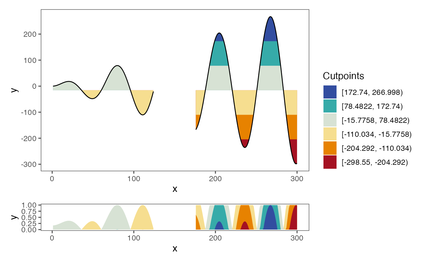
Reversing the values below the origin
Some horizon plots do not reverse the values that are below the origin. If that is the desired output, it can be achieved by setting reverse=T in geom_horizon():
a <- dat_tab %>%
  ggplot() +
  geom_horizon(
    aes(x = x,
    # xend = xend,
    y=y,
    fill=..Cutpoints..),
    horizonscale = 6,
    origin = 'midpoint',
    reverse = T
  ) +
  theme_few()  +
  scale_fill_hcl()

cutpoints  <- tibble(
  cuts = c(78.48221,  172.74027,  266.99833, -110.03390, -204.29196, -298.55001),
  names = c('ypos1', 'ypos2', 'ypos3', 'yneg1', 'yneg2', 'yneg3'),
  color = c("#D7E2D4", "#36ABA9", "#324DA0", "#F6DE90", "#E78200", "#A51122")
) %>%
  mutate(names = factor(names, rev(names))) %>%
  arrange(names)

mid <- sum(range(dat_tab_na$y, na.rm = T))/2

b <- plotAllLayers(dat_tab, mid, cutpoints$cuts, cutpoints$color)


b/a+ plot_layout(guides = 'collect', heights = c(6, 1))
Mirroring the horizon plot
If you cant to mirror the horizon plot, you can do so by setting mirror to TRUE:
a <- dat_tab %>%
  ggplot() +
  geom_horizon(
    aes(x = x,
    y=y,
    fill=..Cutpoints..),
    mirror = T
  ) +
  theme_few()  +
  scale_fill_hcl()

cutpoints  <- tibble(
  cuts = c(78.48221,  172.74027,  266.99833, -110.03390, -204.29196, -298.55001),
  names = c('ypos1', 'ypos2', 'ypos3', 'yneg1', 'yneg2', 'yneg3'),
  color = c("#D7E2D4", "#36ABA9", "#324DA0", "#F6DE90", "#E78200", "#A51122")
) %>%
  mutate(names = factor(names, rev(names))) %>%
  arrange(names)

mid <- sum(range(dat_tab_na$y, na.rm = T))/2

b <- plotAllLayers(dat_tab, mid, cutpoints$cuts, cutpoints$color)


b/a+ plot_layout(guides = 'collect', heights = c(6, 1))