Peak time of day for activities
Sports and leisure activities happen at different times during the day (sources: https://github.com/halhen/viz-pub/blob/master/sports-time-of-day/activity.tsv, https://eagereyes.org/blog/2017/joy-plots). Horizon plots can be used to condense this time series data into a highly informative and easily interpretable chart:
utils::data(sports_time)

sports_time %>% ggplot() +
  geom_horizon(aes(time/60, p), origin = 'min', horizonscale = 4) +
  facet_wrap(~activity, ncol = 1, strip.position = 'right') +
  scale_fill_hcl(palette = 'Peach', reverse = T) +
  theme_few() +
  theme(
    panel.spacing.y=unit(0, "lines"),
    strip.text.y = element_text(angle = 0),
    legend.position = 'none',
    axis.text.y = element_blank(),
    axis.title.y = element_blank(),
    axis.ticks.y = element_blank(),
    panel.border = element_blank()
    ) +
  scale_x_continuous(
    name = 'Time',
    breaks=seq(from = 3, to = 27, by = 3),
    labels = function(x) {sprintf("%02d:00", as.integer(x %% 24))}) +
  ggtitle('Peak time of day for sports and leisure')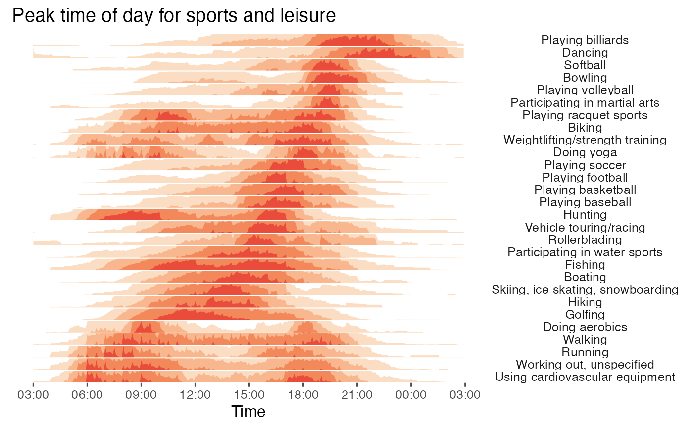
COVID-19 cases in Asia
COVID-19 cases were recorded in waves across the world (source: https://www.ecdc.europa.eu/en/publications-data/download-todays-data-geographic-distribution-covid-19-cases-worldwide). A simple horizon plot is useful for detecting how many waves there have been and when these waves have happened:
utils::data(COVID)


COVID %>%
  ggplot() +
  geom_horizon(aes(date_mine,
                   y), origin = 'min', horizonscale = 4) +
  scale_fill_hcl(palette = 'BluGrn', reverse = T) +
  facet_grid(countriesAndTerritories~.) +
  theme_few() +
  theme(
    panel.spacing.y=unit(0, "lines"),
    strip.text.y = element_text(size = 7, angle = 0, hjust = 0),
    legend.position = 'none',
    axis.text.y = element_blank(),
    axis.title.y = element_blank(),
    axis.ticks.y = element_blank(),
    panel.border = element_blank()
    ) +
  scale_x_date(expand=c(0,0), date_breaks = "1 month", date_labels = "%b") +
  ggtitle('Cumulative number for 14 days of COVID-19 cases per 100,000',
          'in Asia, 2020') +
  xlab('Date')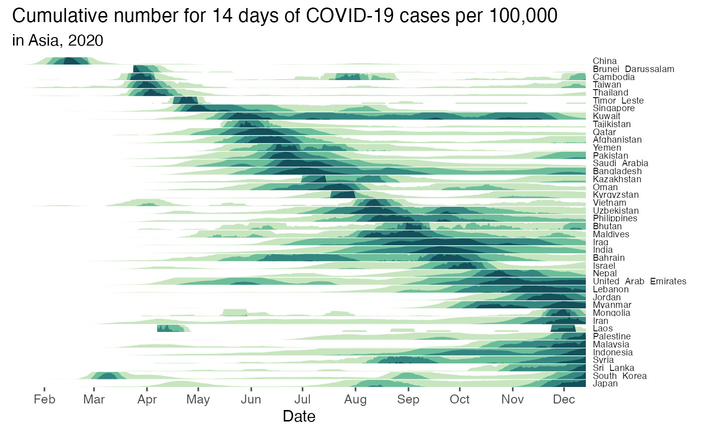
Simple repeat content
Horizon plots are also useful to plot genomic data, such as simple repeat content along the human genome (source: https://genome.ucsc.edu/cgi-bin/hgTrackUi?g=rmsk):
utils::data(rmsk)


cutpoint_tab <- rmsk %>%
  ungroup() %>%
      mutate(
        outlier = between(
          p_repeat,
          quantile(p_repeat, 0.25, na.rm=T)-1.5*IQR(p_repeat, na.rm=T),
          quantile(p_repeat, 0.75, na.rm=T)+1.5*IQR(p_repeat, na.rm=T))) %>%
  filter(outlier)
ori <- sum(range(cutpoint_tab$p_repeat, na.rm = T))/2
sca <- seq(range(cutpoint_tab$p_repeat)[1],
           range(cutpoint_tab$p_repeat)[2],
           length.out = 6)

rmsk %>%
  ggplot() +
  geom_horizon(aes(x = bin, xend=bin_2,  y = p_repeat, fill = ..Cutpoints..),
               origin = ori, horizonscale = sca) +
  facet_grid(genoName~., switch = 'y') +
  theme_few() +
    theme(
      panel.spacing.y=unit(0, "lines"),
      strip.text.y.left = element_text(size = 7, angle = 0, hjust = 1),
      legend.position = c(0.85, 0.4),
      axis.text.y = element_blank(),
      axis.title.y = element_blank(),
      axis.ticks.y = element_blank(),
      panel.border = element_blank()
      ) +
  scale_x_continuous(expand=c(0,0)) +
  scale_fill_hcl() +
  ggtitle('Simple repeat content along the human genome',
          'in 100 kb windows') +
  xlab('Position') +
  guides(fill=guide_legend(title="% of repeats"))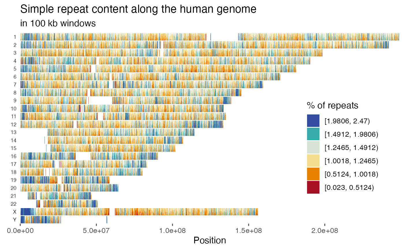
Average temperature in 2000 for major US cities
Changes in the average temperature across several geographic locations can also be condensed in horizon plots. For example, the average temperature during 2000 for major US cities (source: https://www.kaggle.com/sudalairajkumar/daily-temperature-of-major-cities; order of the states:https://benschmidt.org/2014/06/05/optimally-ordering-geographical-entities-in-linear-space/):
library(ggh4x)

utils::data(climate_US)


climate_US %>%
  ggplot() +
  geom_horizon(aes(date_mine,
                   AvgTemperature), rm.outliers = T) +
  scale_fill_hcl(palette = 'RdBu', reverse = T) +
  facet_nested(State+City~.) +
  theme_bw() +
  theme(
    panel.spacing.y=unit(0, "lines"),
    strip.text.y = element_text(size = 4, angle = 0),
    legend.position = 'none',
    axis.text.y = element_blank(),
    axis.title.y = element_blank(),
    axis.ticks.y = element_blank(),
    panel.border = element_blank(),panel.grid = element_blank()
    ) +
  scale_x_date(expand=c(0,0), date_breaks = "1 month", date_labels = "%b") +
  xlab('Date') +
  ggtitle('Average daily temperature of major US cities',
          'for the year 2000')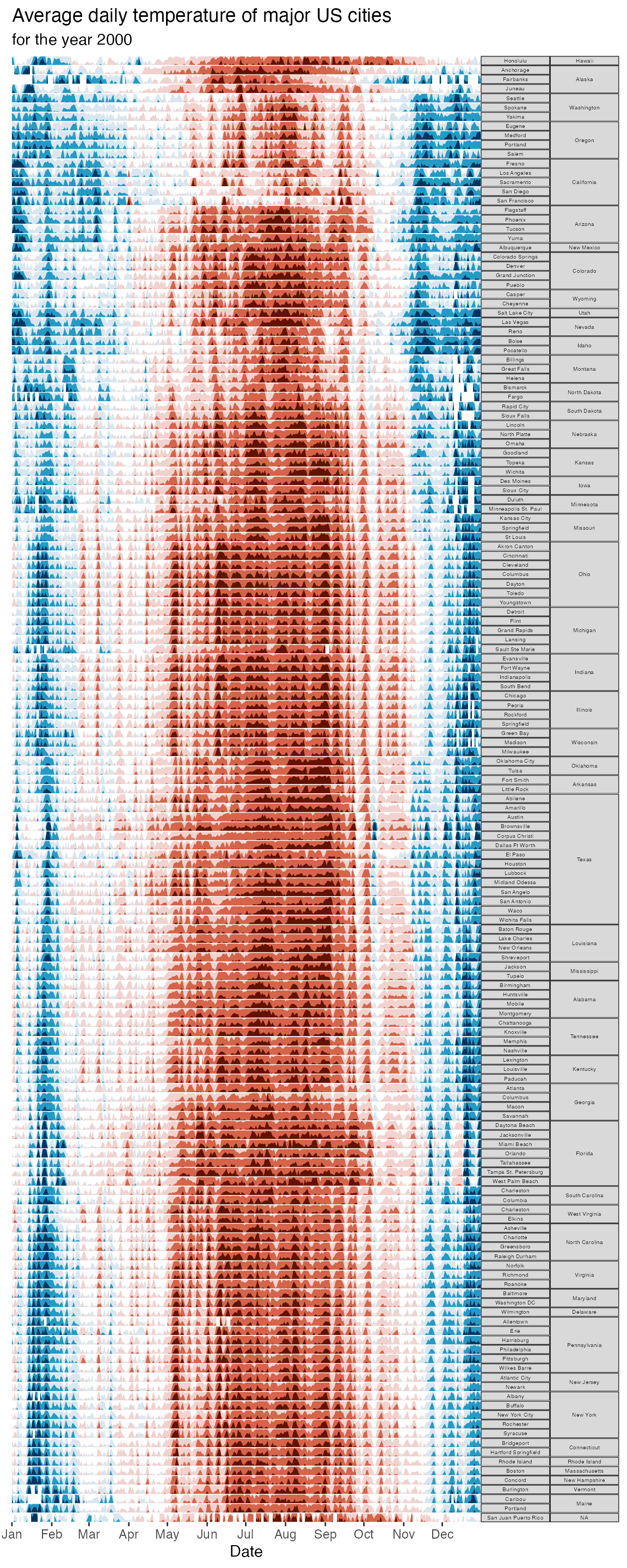
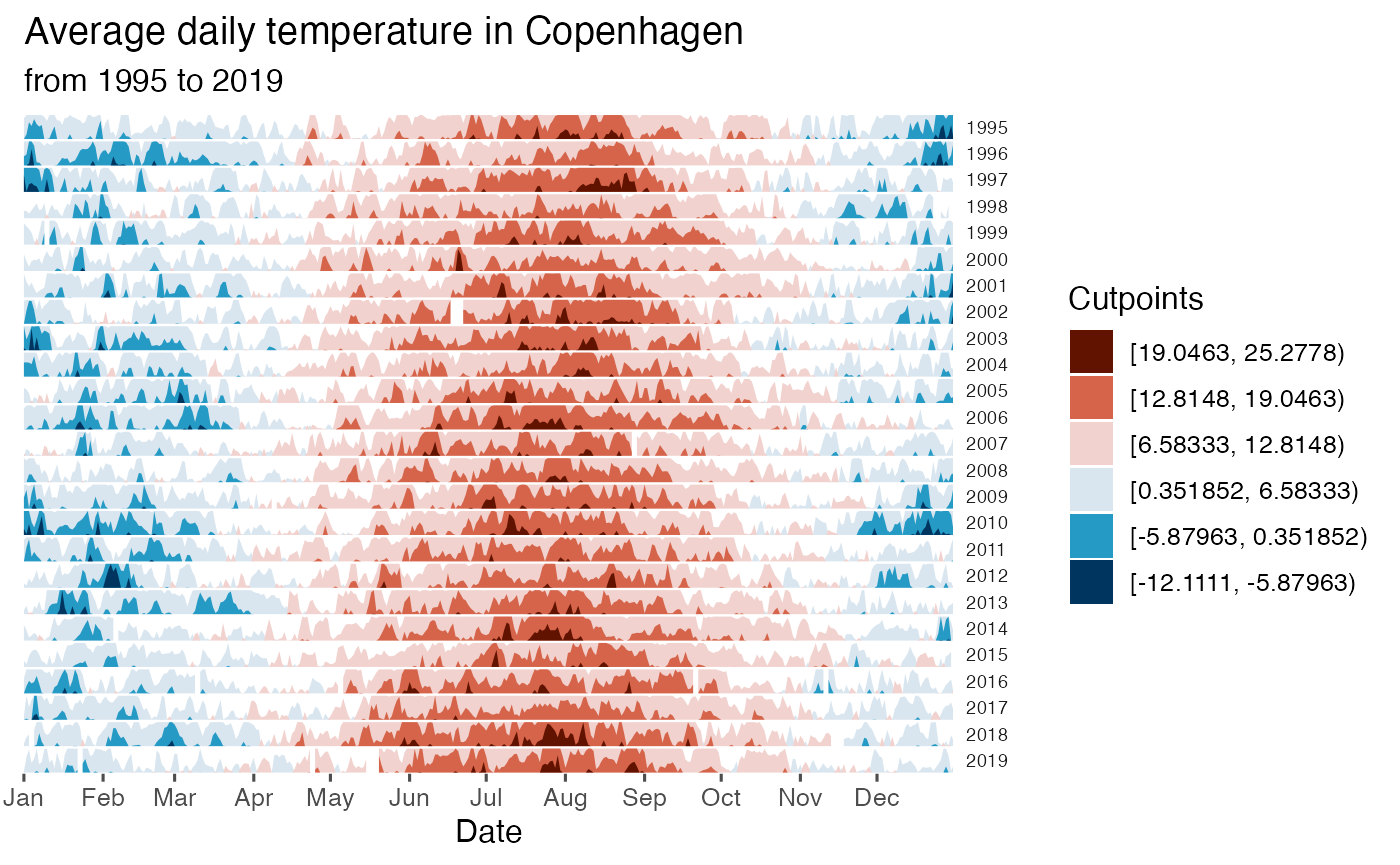
Average temperature in Copenhagen
The average daily temperature can also be plotted by year. For example, in Copenhagen:
utils::data(climate_CPH)

cutpoints <- climate_CPH  %>%
  mutate(
    outlier = between(
      AvgTemperature,
      quantile(AvgTemperature, 0.25, na.rm=T)-1.5*IQR(AvgTemperature, na.rm=T),
      quantile(AvgTemperature, 0.75, na.rm=T)+1.5*IQR(AvgTemperature, na.rm=T))) %>%
  filter(outlier)

ori <- sum(range(cutpoints$AvgTemperature))/2
sca <- seq(range(cutpoints$AvgTemperature)[1], range(cutpoints$AvgTemperature)[2], length.out = 7)[-4]


climate_CPH %>% ggplot() +
  geom_horizon(aes(date_mine,
                   AvgTemperature,
                   fill = ..Cutpoints..),
               origin = ori, horizonscale = sca) +
  scale_fill_hcl(palette = 'RdBu', reverse = T) +
  facet_grid(Year~.) +
  theme_few() +
  theme(
    panel.spacing.y=unit(0, "lines"),
    strip.text.y = element_text(size = 7, angle = 0, hjust = 0),
    axis.text.y = element_blank(),
    axis.title.y = element_blank(),
    axis.ticks.y = element_blank(),
    panel.border = element_blank()
    ) +
  scale_x_date(expand=c(0,0),
               date_breaks = "1 month",
               date_labels = "%b") +
  xlab('Date') +
  ggtitle('Average daily temperature in Copenhagen',
          'from 1995 to 2019')